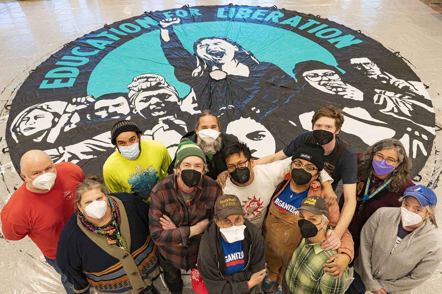
Photo by Joe Brusky.
Every art build is a new learning experience – a chance to learn new techniques and approaches and to amplify what works and to fix was needs adjusting. This rung true with a recent January 2022 art build in Santa Fe that the Art Build Workers co-organized with NEA New Mexico.
The Art Build Workers collaborated with NEA Santa Fe and NEA New Mexico on a statewide campaign in New Mexico where K-12 public school teachers were fighting for the schools their students deserved and for better pay and benefits for teachers and staff who were grossly underpaid and burned out from teaching during a pandemic.
The Art Build Workers (based in Milwaukee) was asked to organize a three-day art build to create banners, picket signs and offset posters leading up to a march and lobbying campaign at the State Capital in Santa Fe. The organizing process began three months before the January 14-16 art build and this writing differs from my past recaps of art builds. Often, I detail the process and how the art was used in the movement – exemplified by past writings for teacher’s union art builds in Chicago, Los Angeles, Oakland, and national conferences in Minneapolis and Houston. With this writing I want to home in on the artists who contributed work to the Santa Fe art build and my specific role in the Art Build Workers – working with the artists and being a conduit between the teacher’s union and the artists designing for the movement. I want to explain my role in the work and what made Santa Fe so unique and such a powerful learning experience.
The Art Build Workers is a collective formed in 2017 of seven people based in Milwaukee – all of whom bring different skills sets to the table. Joe Brusky is the photographer and social media person in the group. He holds this position in the MTEA union and he has been one of the most prolific social movement photographers in the country – documenting both Milwaukee movements (be it MTEA or Voces de la Frontera) or the national teacher’s union movements – the UTLA and OEA strikes. Claudio Martinez is the designer in the group. He is a pro and has been the go-to Voces de la Frontera designer for the past three years. He is also an accomplished photographer and is typically found painting the parachute banners during the art builds. Jeanette Arellano is also found painting parachute banners and the front-of-the-march banners. She is force for social justice – a much beloved person in Milwaukee who works tirelessly as an art teacher in MPS, a staff member at Voces de la Frontera teaching citizenship classes, and as a volunteer with the mutual aid organization Ayuda Mutua MKE. Jeanette brings much laughter and joy to the art builds. Kim Cosier and Josie Osborne do as well with their exceptional people skills. Both are educators at the University of Wisconsin-Milwaukee and both are swiss army knifes within the Art Build Workers. Kim Cosier worked as a house painter many decades ago and those skills transfer well to art activism. She can paint a banner at the speed of light with perfect precision. Kim can also be found on the chop saw cutting down the wood sticks for the picket signs. Josie Osborne is also often found at the banner painting stations. She has a gift of conversation and kindness and makes everyone at the art build feel welcome and loved. Josie leaves each art build with a long list of new friends. Paul Kjelland and I are the screenprinters in the group. We screenprint the picket signs and patches during the art build while also taking on different roles during the two-to-three months of prep time leading up to a build. Paul is the organizer. He organizes the books, orders the materials, sets up the travel, and often drives the supplies to the art build. He is liaison between NEA National, the local NEA leaders and the Art Build Workers. He is on all the Zoom calls leading up to the art build. I am also on the Zoom calls during the months leading up to the build, but my primary role is to work as a liaison between the artists and the local union leaders. My role is to work with the unions on the slogans for the art and the image ideas so that I can clearly communicate the ask to the artists so that they have a clear directive and do not waste their time in the design process. My roll (similar to the art organizer role that I have with Voces de la Frontera) is also to work with the artists so that their work reflects the goals of the movement and that their imagery works well in the context of a march – meaning that it can be read by the camera and by people standing 30 to 40 yards away.
Over the last five-plus years everyone in the Art Build Workers have become very skilled at what they do, but each art build presents new learning experiences and challenges. The Santa Fe was no exception. I would like to detail a few key takeaways from this build. They are unique to Santa Fe but likely not unique to future art build collaborations where the process of listening and adapting is so vital.
Our two main contacts and collaborators for the Santa Fe build were Grace Mayer (the NEA Santa Fe President and an art educator at Milagro Middle School in Santa Fe) and Paul Rohlfing (a national union organizer with NEA.) Grace had noted to Paul that she wanted an art build to be part of the tactics for the NEA New Mexico movement and Paul suggested the Art Build Workers as he was familiar with our past work when he took part in the UTLA art build.
Paul set up our first Zoom meeting and it was a disaster. I was asked to explain what the Art Build Workers do and I went straight into the details on how we organize and how we can duplicate the strength of past art builds – like the UTLA art build – and apply it to Santa Fe. What I forgot and what I learned from was twofold. One, the art build concept is new to just about everyone and it take time and visuals to explain the process of the art build and why movement culture (the banners, picket signs, etc) are so key to the movement. Second, people are by-and-large distrustful of those outside their community and they should be. The first Zoom call in hindsight came across as outsiders from Milwaukee coming in to bring their art and tactics to Santa Fe. That is never our process (it is amplifying the local artists the union chooses) but that was not clearly communicated during the call. The message that we heard from Grace was similar to the message we first heard from LA during our first calls. Why do we need people from Milwaukee coming here? We have artists in Santa Fe. We got this covered. What we (what I) did not articulate clearly was that the Art Build Workers prioritize the local. We are infrastructure and take care of the nuts-and-bolts issues: ordering material, contacting the artists that the union has chosen, exposing silkscreens prior to the art build, cutting down wood for picket signs, tracing the banners, setting up the space, printing the art that the local has chosen, etc. Local union organizers come to understand this clearly during the art build, but I was reminded that this has to be clearly articulated in the initial meetings. Once our process was clearly communicated with Grace over subsequent Zoom meetings it was all good.
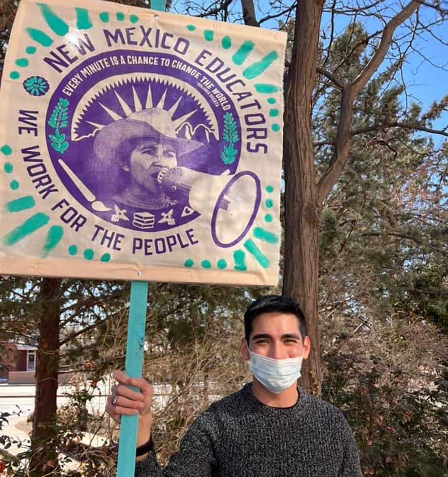
Another key learning moment was to listen and to make sure that art builds are unique to each community. Some tactics should be duplicated across various art builds, but one size foes not fit all for one size does not honor the local. I recall in one Zoom meeting that I was articulating how choosing one to two color choices for all the banners and picket signs is a powerful unifying force. I noted that the teacher’s union movement has adopted red as a color and the slogan Red for Ed and Grace quickly shot down that idea. She said that red is not their colors and not unique to Santa Fe: the colors should be turquoise and black. We all listened and agreed. Honor the local. Grace’s insistence that the art should be turquoise and black turned out to be one of the most crucial decisions of the art build process. You can see from the photographs from the march at the State Capital Roundhouse how powerful the color scheme was and how unique it was to the region. The learning reminder was to always create space for the local union to put their own stamp on how the art for their march and their movement will look like.
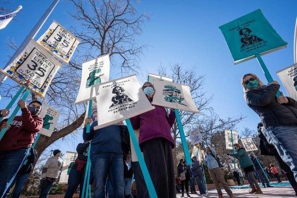
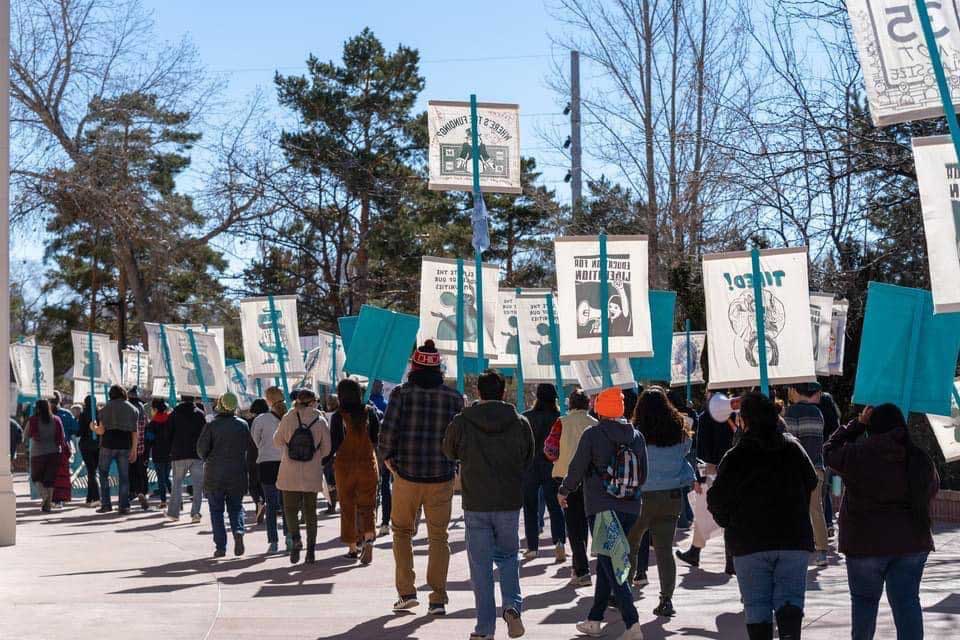
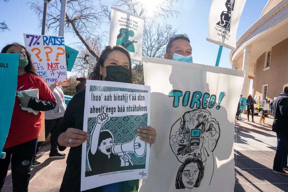
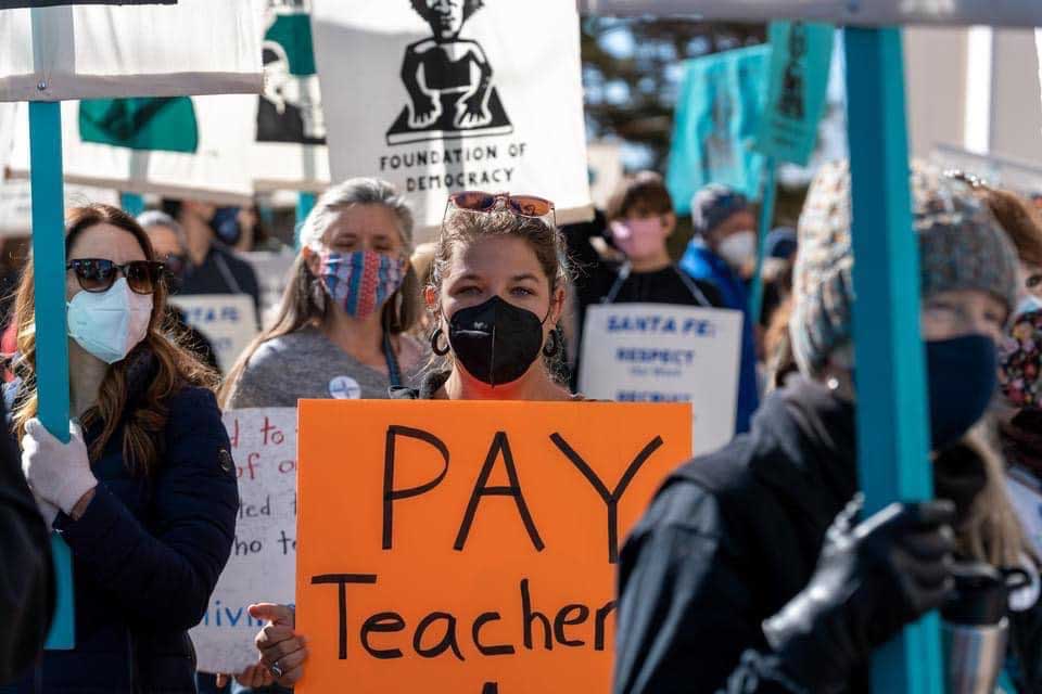
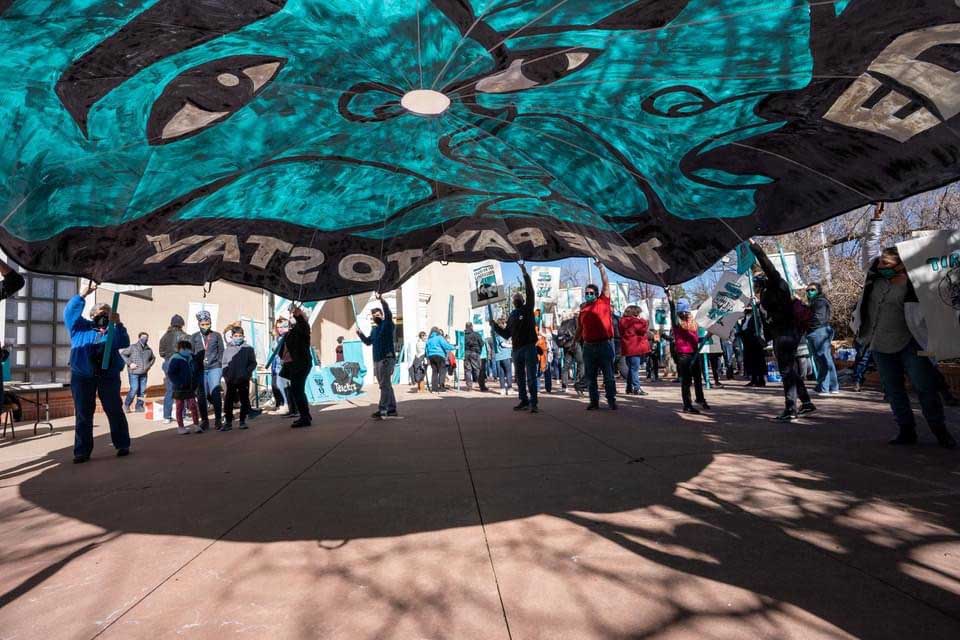
The process of working with artists was also informative. A common misconception about art builds is the notion that an art build is simply a room full of supplies and people then show up and intuitively make their own banners and signs and paint whatever comes to their mind. That scenario could work for some art builds, but we avoid that path for a multitude of reasons. The first reason is that the union and the movement have specific demands so it is the union who should come up with the list of slogans. The art always needs to align with the goals of the movement and the union needs time to see the drafts and to add input. In short, artists need to take direction from the movement leaders. This carefully considered process takes time and happens in stages. It is akin to a construction project. Carpenters, roofers, plumbers, painters, etc don’t just show up a job site and intuitively grab materials and start building. Their work happens in stages and it follows the steps of the architectural plans. The same with art builds. Materials need to be ordered in advance. The union and the art build organizers have to consider ahead of time what size the banners should be and how they will work in the locations they will be marched in or hung. This then needs to be clearly communicated to the artists creating the designs. The Art Build Workers also screenprint the picket signs so those screens need to be prepared far in advance. Thus, the process unfolds over time. The union provide a list of slogans and formats for the artists to design for. Then the artists provide a draft for critique. I am always careful to assert that the artists should only do one revision total. It is up to the movement to be clear when putting out the call for art. They should also be very clear with any suggestions for edits. Artists are workers too and their time and skills need to be honored so the norm should always be one revision only after feedback is given.
My role in the Art Build Workers is to communicate this process to the artists and conversely, to communicate to the union leaders the key information that the artists need. For the Santa Fe art build I was asked to work with five local artists and three national artists. Our process for inviting artists to participate is twofold: we share an open call to participate that is disseminated by the teacher’s union to its members, to the community, and the art teachers who often share it with their students. We also commissioned a number of artists. The union determines who these artists are and for the Santa Fe build they chose seven artists. Grace Mayer also asked me to reach out to three national artists and she opted to select from the Justseeds Artist’s Cooperative roster. She looked over the artist page and selected Favianna Rodriguez, Melanie Cervantes, and Pete Railand. She had prints by Melanie and Favi in her classroom and was excited to hear that Pete had a connection to New Mexico and had lived in both Albuquerque and Santa Fe and was knowledgeable about the culture and the vernacular architecture. We quickly decided that Pete would be best to design an image about the lack of affordable housing for educators in Santa Fe.
Once I had clarity from the union, I communicated the design ask to the commissioned artists. I stressed to them that you don’t always have to create a new image. Artists can create a new image for the movement, but there is also the option that a past image could also be adapted. That image will be new to nearly everyone who sees it in the context of a march and a past image might be more applicable to the format of a banner, picket sign, or parachute banner. What matters is how the art communicates in the march and how it communicates to the camera. Most artists and designers have little experience when it comes to designing banners, picket signs and the circular parachute banners that are 24’ wide. They don’t often consider if the camera or a person fifty yards away can see it. Artists typically show their work in a gallery or online on social media where the viewer can see the image close up. Our friend David Solnit – a Bay Area arts organizer and mentor to the Art Build Workers – has a saying “If you can’t see it, you can’t read it, you can’t win it.” Thus, my role is to work with the artist to make sure that their images work for the planned action. This may mean selecting bold graphics that can translate well to screen prints or choosing fonts that can be read well on a banner. The Santa Fe art build also presented another parameter: making sure all the art had the color scheme of turquoise and black.
My conversations with the artists in the Santa Fe art build was great from the start. The directions from the union was very clear and the artists were honest and up front with their time constraints. Melanie Cervantes had a past image that she thought would work – one that had the slogan “Education for Liberation” that was part of her original image. I remember showing the drafts to the Santa Fe art build committee and I noted that we could potentially substitute her slogan with one of the unions selected slogans. The art build committee thankfully said no, let’s go with Melanie’s slogan.
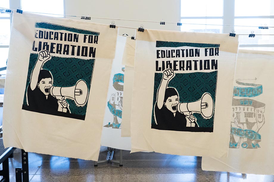
This was one of those moments where the artist brings new ideas to the movement and takes a key role in really shaping the visual culture of the movement. It reminded me of the Poor People’s Campaign and the brilliant design and slogan that Jesse Purcell came up with “Fight Poverty, Not the Poor.” From my understanding, Jesse was the one who came up with the slogan and it quickly became one the key slogans and iconic images of the movement. To me, it makes sense to give artists a lot of leeway. Yes, they are designing for the movement, but artists work in the realm of creativity. Movements should utilize their creativity and welcome in their new ideas.
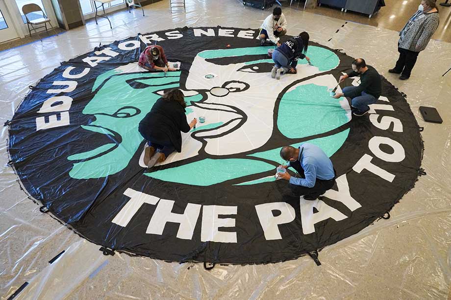
Favianna Rodriguez also shared past images. She is so gracious with the teacher’s union movement and other movements that I work with (Voces de la Frontera) that she allows the Art Build Workers to add new text and color schemes to her work as long as we run the drafts by her. This makes sense. She has a ton of projects always going on and this way she can have her past images serve the movement, and also she can receive an honorarium to support her current work. For Favi’s images I added the text slogans, the color schemes, and graphic design and Claudio did the graphic design for her parachute design.
Pete Railand provided a sketch for the critique process. He is a linocut artist so it was a given that he would be making a new image, one that is always time consuming to carve. It was imperative that the critique given to him was without fault because there would not be any more changes once he started to carve. His image, unsurprisingly, was perfect and was much loved by the Santa Fe union.
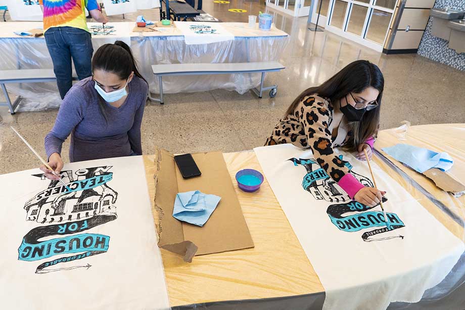
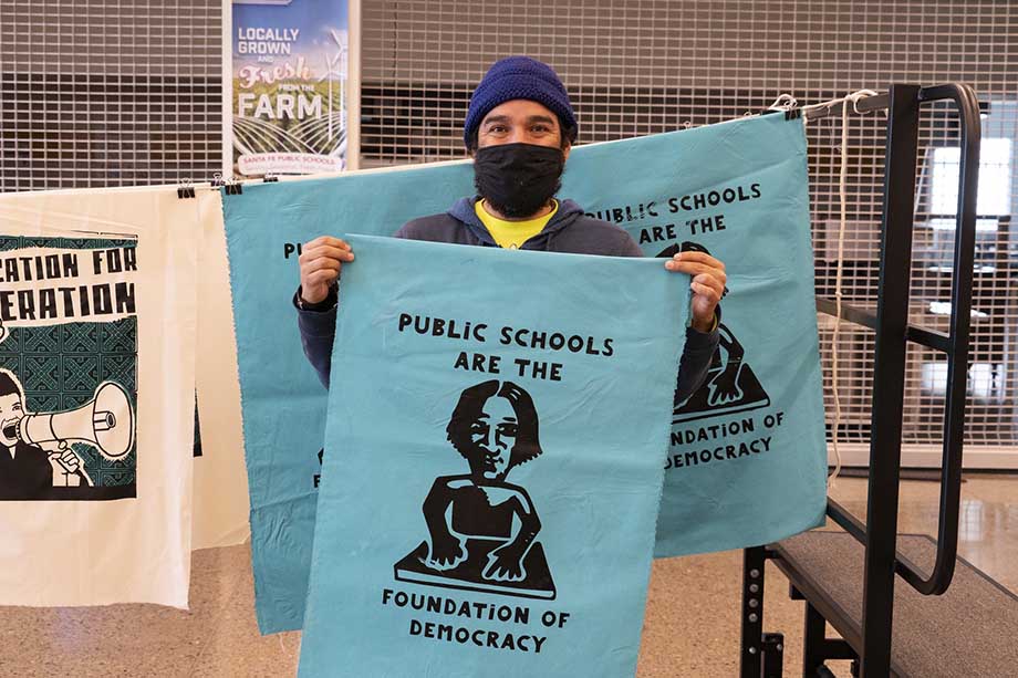
David Sloan provided a beautiful drawing that he initially designed for an offset poster. I recognized that his imagery had the power to be one of the iconic images of the movement and adapted his design as a banner, picket sign, and offset. I changed the font and added the turquoise and black color scheme. David approved of all the changes and we were all thrilled when his image (along with Melanie’s) were chosen to be an offset poster with 1,200 copies of each design being printed with versions of each posters printed in English, Spanish, and Navajo.
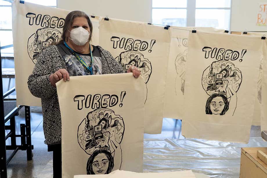
Grace Mayer also made a signature image. She noted during the Zoom calls prior to the art build that she could make an image for the march and my reaction was what could be better than the union president making one of the key images for the movement. It was moments like this that made the Santa Fe art build special and really unique. Her hand-drawn image had text that read “tired” that summarized in one image what teachers of all levels have been feeling, especially during the pandemic. It summarized that all teachers need to be valued more in society: teachers need more respect and they need better pay and benefits.
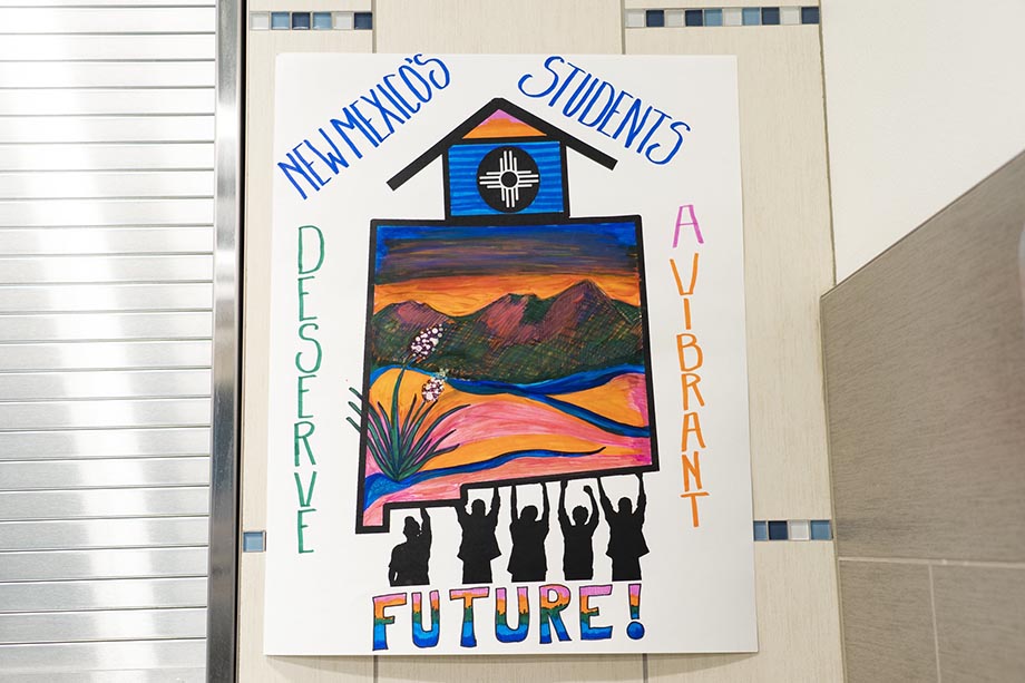
Two local artists also created fill in posters. A fill in poster is essential to the art build for the image has space to allow participants at the art build to add their own slogans and colors to the image. Julia Dickenson’s image featured a vernacular New Mexico style building being held up by the community. Paul and I screenprinted 150 copies of the image on poster board that were then left on tables at the art build for participants to add their own voice to the images with sharpies. Some of the results were stunning.
Another fill in image was by Merrill Swim who created an image that was perfect for a kids corner. Art builds are about community building and creating a safe space for all. We always encourage and welcome families to bring their kids. We set up a kids corner where young people can make art and color in the fill in posters.
A final learning experience that I want to mention from the Santa Fe art build was that it was not the only teacher’s union art build happening that weekend in New Mexico. The state encompasses a large geographical area and it was not practical for teachers in all corners of the state to attend the Santa Fe build. Instead, other locals – most notably Las Cruces – held their own mini-art build during the same weekend where over 40 people attended. NEA organizers had shared the Santa Fe art images with other locals across the state, but Las Cruces thankfully elected to create their own designs. Stephanie Preciado created a design with an image of Dolores Huerta, Chris Shelton created a design with a monopoly man running off with money, and Chris Bardley created the class size/speed limit design, plus a fill-in poster. These three artists, plus NEA New Mexico Organizing Specialist Amy Simpson and NEA-LC member Erica McDowell made the Las Cruces build happen. The designs were all top notch, but what really inspired me was the idea of multiple art builds taking place during the same weekend.
These examples were all key learning movements. As were the times to step back, listen and let local organizers put their stamp on the art build. The best scenario for art build organizer is to see other allies embrace the tactics and to self-organize. In New Mexico that took place and that bodes well for all in the future.
Joe Brusky videography during the art build:
For updates on the NEA New Mexico contract campaign and legislative victories, please visit their site here.
NEA Today article: “How Art Plus Activism Led to Teacher Pay Raises in New Mexico”
Update from March 1, 2022: MAJOR VICTORY!
Governor Michelle Lujan Grisham: “Today I enacted historic raises for New Mexico teachers, the first step to making New Mexico educators the highest-paid in the region. Minimum New Mexico educator salary levels will increase later this year to $50,000, $60,000, and $70,000 – an average 20% increase. New Mexico teachers deserve better compensation, it’s as simple as that. In 2019 we dramatically increased base educator salary levels and secured 6% raises for all NM educators, followed by additional 2% raises in 2020 – but there was more to be done, and today we have delivered it.”
